I have been away from this blog for awhile and am finally back. My old laptop bit the dust, and I could not get a blogger app to work (wrote a whole post with thumb-typing, only to have it eaten! What happened to the old app that worked fine? No idea...). My internet and email access has been very limited for the last couple weeks or so. I am now back in business with a gently used refurbished laptop.
I have been immersing myself in Instagram lately and really enjoying the creative community I have found there. My brush lettering obsession still rages, so that is mainly what I am working on every day, little by little. In January I participated in an alphabet challenge, one letter per day.
One day I did this page after learning a new euphemism for cabin fever. It made me laugh so much and is just so accurate for how January felt...
And now for February, I am participating in a Scripture lettering challenge.
I have been wanting to do something with more words, but can't stomach most of the vapid, "power of positive thinking", motivational quotes ("You can do it" "You're awesome" "Think big" etc.) that I keep seeing others do. I can't help but feel that those trite sayings are deceptive and I want to say something true.
The theme of this scripture challenge is "love", of course, because it is February and Valentine's Day all anyone can ever think of celebrating in such a dismal month.
My lettering is far from perfect, and the mistakes glare at me from the photos, but I post them anyway and move on to the next one because it is all practice and all in fun.
But now that I have a working (and so much faster!) computer, I need to get back to business and what I was supposed to be doing. My mom's website is in dire need of an update, and now's the time to get to it. It's really not my favorite way to be creative because it's less "pretty stuff" and more staring in puzzlement at code I barely understand and solving problems with that code and it's a big stretch for my puny, non-techy brain. But I can sharpen up my skills a little this way... if I don't use it, I'll loose it. Still planning to keep up with my lettering practice every day, so more later...


You are doing so well with the lettering! Very impressive. I absolutely LOVE the quote with the red flowes! So well done, the flowers are beautiful. I am loving watching your progress.
ReplyDeleteCan't wait to see some progress on my website too. ;-)
Thanks! I really liked how that one turned out, too. The flower technique is one I have been practicing. Loose florals look so simple, but are actually tricky to make them look like flowers and not blobs, haha.
DeleteAnd I was loading software today, trying to get this computer ready to roll... progress soon, I hope. ;-)
Welcome back, Katie. I am glad you got a working machine.
ReplyDeleteYou are making some beautiful lettering pieces. Color choices on the last one above are close to divine, aren't they?
Question: For color fades in a letter, do you do more than one stroke, or do you have a pen/brush/implement that holds more than one color, like we do in painting sometimes, using different edges?
It is so good to persevere in the creativity and not get sidetracked or discouraged or impeded by pieces you don't find perfect.
Best wishes with the technical stuff, too.
Thanks! That last one is Peacock and Opera Rose, one of my favorite combinations for bright, happy colors. I have watched lots of videos of the process of lettering with watercolor and they do a surprising amount of backbrushing over the letters to get the colors to blend just right and fade from one to another. I try to use as few strokes as possible and get the right line thickness all in one stroke because I think the watercolor looks fresher that way. I just change color for the next stroke, and the colors run together a little. It takes some control, though... you can see in the capital "L" that the change is too abrupt. I also used a waterbrush with this, which is a different kind of control vs. dipping in water.
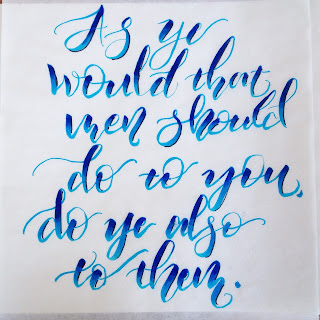
DeleteOh, and the blue 'golden rule' piece is done with Tombow brush pens, two blues and a blender pen to blend them. So that one is actually not paint. :-)
DeleteThanks for the explanations. That helps the understanding.
ReplyDeleteAHHHHH! These are SO pretty! I need the "Shack Batty" one on a mug. lol SERIOUSLY, you should get like a Society6 store or something, these are so cool!
ReplyDelete(And when you mentioned coding, my amateur-nerd heart got all excited lol)