
Hello! I will resume posting Tuesdays here again, if that is okay with everyone. :)
Some updates from the month of June:
- No, we did not make the deadline for the webcomic contest (sadness); however, we are finishing the story (at our own sweet crippled pace, haha) and posting the rest in the same place, once the entries are unfrozen for the judging period.
- No, I did not get any life drawing in. (Hides)
- I was really flustered with trying to find a new place to live and packing up all my stuff -- and then find that actually I do not have to move for a few months. (grrr...yay?)
- I like wildflowers.
- I've been arting as much as ever, it feels like, although I can't really find anything that's shareable? Mostly stuff like doodles and greeting cards and lots of working on digital stuff for the comics.

Also, I dragged myself over to try the new Blogger interface thing...*sigh*
I'm not usually a fan of most Updates, especially when they are super different from what I am used to working with, or are pretty much pointless and annoying and it seemed like the team behind the new rollout was just bored and wanted something to change.
It seems like the main idea behind these changes here is to create a more mobile-friendly experience, which, honestly, I dislike to admit was quite overdue. We will see how effective they are as time passes, because I'm not excited to try going through that anytime soon to see how the headache-o-meter has fluctuated.
For now, we need to know: Will we be able to continue blogging here? Or will we end up driving ourselves insane in a labyrinth of strange buttons and newborn bugs?
Well, I hope I can help you find the answers to some of these burning questions, although I am a little late to the party, as usual (I think I saw that the changes are happening this month?). If you have already explored on your own, or have had someone more knowledgeable than I check it out for you by now, great! And if you know something about this stuff that I didn't cover, or you have other quests for me, let me know! XD
Without further ado, I present my hesitant adventure into the unknown territories.
I was glad to see the setup isn't terribly different from what I am accustomed to...I find some of the differences quite annoying, but others I could care less about as soon as I get used to the new look.
 |
| (I'm gonna scribble all over the screen captures, don't mind me, haha...) |

Below is the new interface. You can go back to the "legacy" setup (for now) by hitting the link I labelled (A). One thing I saw that's new that might be useful was the Search Posts bar at the top of the page, where you can look for keywords or phrases from past posts to help you find them faster, I assume. (I didn't try that part out yet.)

The question mark button (B) is where you are supposed to leave questions or feedback or whatever, if you so desire.
The little drop down which shows up as All (number of posts) (C) as the default, is where they stuck the categories of drafts and scheduled posts and such, which used to be in the main menu on the left side with Settings and friends.
When you hover over the box for a published post in the list, a little eyeball symbol will show up to the right of it (D). I clicked all over the place, but the only way you get to the page with the post is if you click on the eye symbol and nowhere else. (I was a little frustrated with that, hahaha.)
If the post is still a Draft, it will give you other options. Most of them have little description labels when you hover over them, so I didn't bother marking them here; but you can do things like publish the post or delete it from there. (Yes, it double-checks with you if you really want to delete it, but it does not ask before publishing, so beware of crazy clicking mistakes or something hahaha)
 |
| (Behold also the New Post button, now in the lower right corner.) |
Starting a new post is mostly the same. There's the title bar to fill in at the top, and you type in the big box underneath like normal.
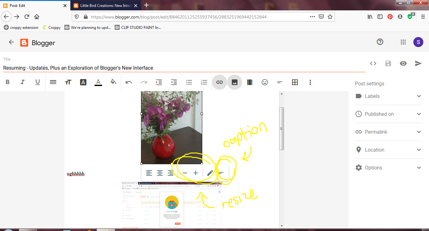
One thing I am really not loving is how much more annoying uploading pictures to your post is.

 |
| It doesn't hold your uploads anymore in the box for you, so that you can leisurely select the ones you wish to place, and choose the order they should go in. :( It just slaps them all in immediately! and then you are left struggling in the wake, trying to find where they all ended up in your text box. |
I also don't like that they banished the text alignment toggles to a far away hiding place in the corner to the right, where the three vertical dots indicate More Options. Why are they in a timeout? I use them a lot, ugh. Especially when the new photo uploading system makes maneuvering your images into the places you actually want them to go even more difficult, haha...
 |
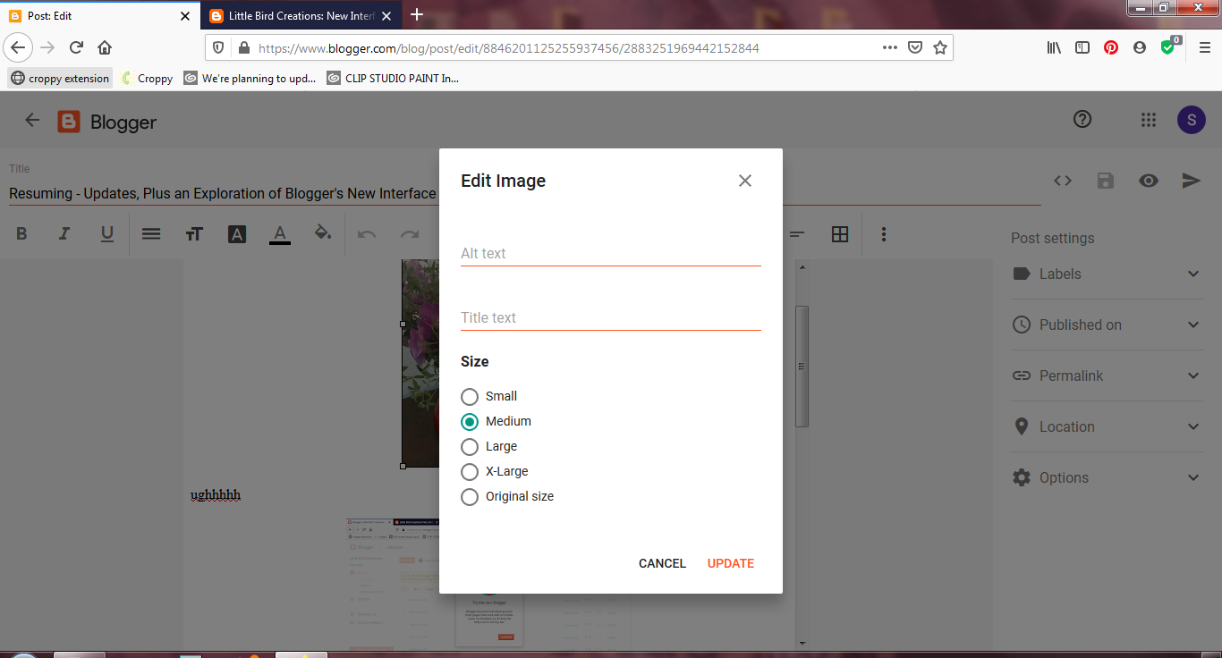
| Also, adding captions is more annoying. It won't let you type immediately; you have to make sure to select the Add Caption text and/or backspace/delete. |
 |
| This is the menu that comes up when you hit the little Edit pencil icon. |
The other Post Settings in the menu to the right are mostly the same.
And that's about the size of it! Nothing we can't learn to work with, I'm sure. XD
So yeah! I hope this was helpful, or at least entertaining, haha - and if you have any questions or suggestions or other input, I'd love to hear about it!
Stay safe and healthy!
Thanks for taking the time to explain all that, Sarah! I'm sure that will help with the adjustment.
ReplyDeleteYay! Thank you! :)
Delete